Showing posts with label 3.3 Exercise Three. Show all posts

Tuesday, January 20, 2009

Exercise 3.3 By Gretchen Romin, Kyla Blair, Dennis Oba, Andrea Cata Ro and Garrett Tonge

Uniform Connectedness

Uniform connectedness is often used to group or connect elements in a design.
It emphasizes that when connected to one another by “uniform visual properties”, elements are recognized as being in a group. Thus, these elements are perceived as being more related then others elements that are not connected.
Common regions and connecting lines are the two methods to accomplishing this connectedness in a design. When elements are grouped within a region by coming together and connecting a visual area it is by method of common regions. Common regions are therefore, most effectively applied to group text elements and collections of control elements. However, if connected elements are grouped due to an explicit line joining the elements then this is the method of connecting lines. Consequently, this method is often used when to group individual elements and imply sequence.
Uniform connectedness can be an effective solution to correcting poorly designed control and display configurations. This is due to the fact that it overpowers the other Gestalt principles and therefore its use may conceal and correct poor design choices.


Closure

Closure is one of the Gestalt principles of perception in which people perceives individual elements as a pattern rather than multiple individual elements. It is so, that the human eye will fill empty spaces and close certain gaps to complete the pattern.
Closure occurs when elements approximate to each other. This principal helps designers to reduce complexity, organize, and communicate information. Using closure, designers can engage the viewers into the design by minimizing certain elements that can be filled up by the viewers.

Good Continuation

a Gestalt principle of organization holding that there is an innate tendency to perceive a line as continuing its established direction.
Good continuation is important in the design of tables, especially in the alignment of columns. Readers should not look down a column to see the good continuation broken by a rule line that is intended to frame a subheading. Inexperienced document designers sometimes position subheadings in a centered position over the columns and then bound the subheads with horizontal rule lines above and below them. When designed in this way, the horizontal lines may interfere with the reader's ability to connect the column headings with the data. In effect, this strategy carves up the content into parts which are marked by the rule lines.


Exercise Three - Anna, Anthea, Hayley, Komal & Nicole

Alignment
Alignment is the placement of text and graphics in relation to other objects. It is one of the principles of design that help us create unity, attraction and readability.

We use alignment to:
• create order
• organize page elements
• group items
• create visual connections

Good alignment is invisible. Most readers will not consciously notice that everything is lined up neatly but they will feel it when things are out of alignment.

There are several types of alignment that can work together to create a pleasing layout:
horizontal alignment - left and right margins are visually equal
vertical alignment - top and bottom margins are visually equal
edge alignment - lines up text or objects along their top, bottom, left, or right edges
center alignment - may be horizontally or vertically aligned, or both
visual or optical alignment - objects may not be precisely aligned but to the eye they appear lined up

Layering
Layers are used to work on individual parts of an image while not affecting other parts. You might say that layers are like transparency papers stacked on top of one another which can be repositioned and separately drawn on without disturbing each other.

There are two types of layering:
two-dimensional layering - the viewer can only see one layer of information at a time. They can be either linear, which are used for stories that have a clear beginning and ending, or non-linear, which are used when a reinforcement in a relationship between layers is needed. Two-dimensional layering is used to manage a problem through information.


three-dimensional layering - the viewer can see multiple layers of information at a time. They can be viewed as either opaque or transparent groups of information, which lay on top of each other. Three-dimensional layering is used to expand on information and show ideas without changing the subject matter.


Signal-to-Noise Ratio
Signal-to-noise ratio refers to the amount of relevant information vs. irrelevant information in a design. The signal is the information intended to get through, and the noise is extraneous information that degrades the signal. A high signal-to-noise ratio is desired in any design, where the clarity of the signal is not clouded by the useless information that is the noise.

Maximizing signal means communicating clearly and efficiently, with a clear and simple presentation of information. For example, using the wrong type of graph can manipulate the signal and distort the fundamental information that is trying to get through. Maximize signal-to-noise ratio by keeping the design simple, enhancing key elements and minimizing or removing unnecessary clutter.

Minimizing noise means avoiding excess and keeping things as simple and concise as possible. For example, thinning out the lines on a graph, removing unnecessary patterns or details, and even minimizing the necessary elements to the point at which they are still functional.

HIGH SIGNAL-TO-NOISE RATIO

LOW SIGNAL-TO-NOISE RATIO


Highlighting

Highlighting is a way to increase the importance to a certain area, and to grab the viewers’ attention first. Highlighting words or images in small amounts works, as well as changing certain aspects of the type such as the case, italics, underlining, and most commonly bolding. Changing or adding colour, as well as inversing the colours already present works well in small doses and in conjunction with other methods. Blinking or flashing is very effective but it draws all attention to itself and therefore takes away from the data overall.


Olivia, Claudia, Annika, Margarita, Rebeca

Alignment is used to connect elements together. Alignment also creates a sense of unity and cohesion, which helps with the overall aesthetics of the design. Alignment can also help to dictate where the eye should be led, leading a person through the design. Alignment generally describes column or row however there are more complex ways to align elements, such as alignment paths that are on angles.


Highlighting is meant to make elements in your design stand out. No more than 10% of a design should be highlighted, it can be distracting. The highlighting techniques should be used sparingly throughout.
  • Bold- good to use, it does not add noise to design
  • Italics- does not add noise but less detectable and legible
  • Underlining- adds noise, use minimally
  • Typeface- use uppercase for short word sequences (different fonts are hard to pull of aesthetically)
  • Colour- use with other techniques, make sure to use desaturated colours that are very distinct
  • Inversing- works with text, adds noise
  • Blinking- use for critical information that requires immediate response, turn off blinking shortly after because it is not very legible

Signal-to-noise ratio is the balance of necessary and unnecessary information in a display. The highest possible signal-to-noise ratio (more signal and less noise) is preferred in design. Signal is valuable information and noise is unrelated or irrelevant information. High signal-to-noise ratio will communicate information clearly. To minimize noise one should keep things simple and removing all unnessesary elements (ex. Thick lines, patterns, unnessesary picture)
ABOVE is the example of lower signal-to-noise ratio (noise/pictures are not necessary).


ABOVE is a higher signal-to-noise ratio (very simple and to the point).


Layering is the process of organizing information into related groupings in order to manage complexity and reinforce relationships in the information. There are two basic types of layering: two-dimensional and three-dimensional.
ABOVE: Two-Dimensional Layering - Linear
ABOVE: Two-Dimensional Layering - Non Linear - Hierarchical

ABOVE: Two-Dimensional Layering - Non Linear - Parallel

ABOVE: Two-Dimensional Layering - Non Linear - Web

ABOVE: Three-Dimensional Layering - Opaque

ABOVE: Three-Dimensional Layering - Transparent

Sunday, January 18, 2009

Exercise Three: Karan, Steph, Lesley, Wendy & Jeannie


The Law of Common Fate:
-Groups of elements which are seen as being related to one another due to their common movement.
-This is most effective when the elements move in the same velocity, time, and direction. Applied, a stationary object is perceived as the ground, while as mobile objects are perceived as figure elements.

Laws of the Interference Effect:
-When our brain is performing two mental processes simultaneously, they compete. This causes our thinking to be slower and less accurate.
- There are several different examples of interference effects: Stroop Interference, Garner Interference, both dealing with perception and Proactive Interference, Retroactive Interference, both dealing with learning.
- Retroactive Interference example: remembering a new telephone number interferes with the memories of other
numbers.
- Designers should prevent interference by avoiding both learning and perception interferences.
Law of Orientation Sensitivity:
-How efficiently people can process the orientation of lines. Depending on the orientation, certain lines can be processed more quickly than other line orientations.
-Oblique Effect: It is easy to perceive the orientation of lines that are close to being horizontal or vertical lines, than it is for oblique (not straight/direct) lines.
-Pop-out Effect: In an image, certain elements that pop out as figure elements which are easily noticed.

Exercise Three: Katie, Christian, Andrea, Kaitlynd,

Law of Pragnanz: This strategy for conveying information basically states that when someone is presented with an image that has no clear specific interpretation, that generally it will be presumed to take on the simplest possible understanding. For example, we perceive this image as a group of circles, as opposed to a larger group of more complex shapes.


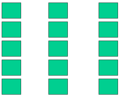
Law of Proximity: This principle of perception maintains that elements that are placed closer together will be perceived as being more associated with one another, as opposed to those elements that have more distance from one another. The law of proximity suggests that this image will be understand as consisting of three columns, not 5 rows.

Law of Figure Ground RelationshipThis Gestalt Law of Pattern Perception states that a figure element is the object of focus, and can be determined as such by being more defined than the ground element, which comprises the background. A clearly defined figure and ground in a composition create a relationship that is stable, which allows us to remember the figure more clearly.

Wednesday, January 14, 2009

Exercise Three: Strategies for Conveying Information

Your group for Project One has been assigned 3 or more examples of strategies derived from the Gestalt Laws of Pattern Perception that can be employed to convey information.

Click here to download the relevant pages from Universal Principles of Design. In your Project One groups, create a blog post that summarizes your assigned strategies for the class. For each strategy, include at least one illustration that is not found in Universal Principles of Design. Be prepared to briefly present your post next week.

Exercise Three is due at 08:30 on Wednesday, January 21.